A quick tour of the interaction patterns.
The showcase groups the components by how they feel in a real interface: motion buttons, hover previews, animated text, loaders, backgrounds, and layout systems.
50+
components
9
categories
Live
previews
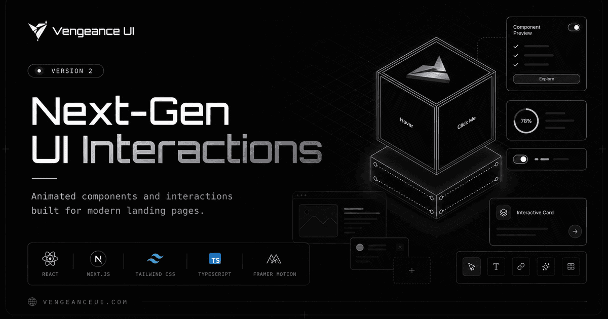
Vengeance UI
Product page
Cursor and hover effects
Image trails, cursor cards, reveal lists, and animated links for richer browsing.
Animated copy
Flip, fade, liquid, morphing, and numeric text treatments for product messaging.
Layouts with motion
Bento grids, carousels, docks, navbars, and cards that hold up responsively.
Showcase focus
Each family is built around an interaction that can make a production page feel less flat.
Cursor and hover effects
Image trails, cursor cards, reveal lists, and animated links for richer browsing.
Animated copy
Flip, fade, liquid, morphing, and numeric text treatments for product messaging.
Layouts with motion
Bento grids, carousels, docks, navbars, and cards that hold up responsively.
How to use it
Start from the showcase when you know the effect you want, then jump into the docs page for install commands and props.
Preview
Open a component to see the demo in the docs frame.
Install
Use the CLI tab or manual install tab depending on your project setup.
Adapt
Tune props, class names, and copy for the exact page you are building.
Recommended path
Browse by category
Find the interaction family that matches the section you are designing.
Inspect props
Check the docs table so animation timing and behavior are explicit.
Ship lightly
Use the smallest component that gives the page the motion it needs.